Created with clarity in mind, these minimalist stick figures:
Are language-neutral
Can be understood in seconds
Are standardized in airports, train stations, and tourist areas
Their simplicity is intentional: graphic designers crafted them to cut through noise and lead you straight to your destination—no translation needed.
4. When Signs Get Confusing
Not all restroom signs aim for clarity. Some cafes, bars, or boutique shops replace standard icons with playful illustrations—like a top hat for men and flowers for women, or mustaches and bows.
While creative, these designs can cause hesitation, especially for non-native speakers or those unfamiliar with local humor. In high-traffic international areas like airports or train hubs, authorities stick to WC labels and standard icons to avoid confusion and ensure accessibility.
5. Words on the Door: Polite or Direct?
The wording beside icons also reflects cultural attitudes:
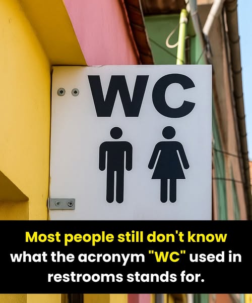
In Europe and Asia, “WC” dominates—it’s neutral and widely recognized.
In the U.S., “Restroom” is preferred because it sounds more formal and discreet.
In the UK, “Toilet” is straightforward and commonly used, but Americans often find it too blunt or clinical.
These subtle preferences reveal how culture shapes our approach to even the most universal human functions—balancing politeness, practicality, and privacy.
